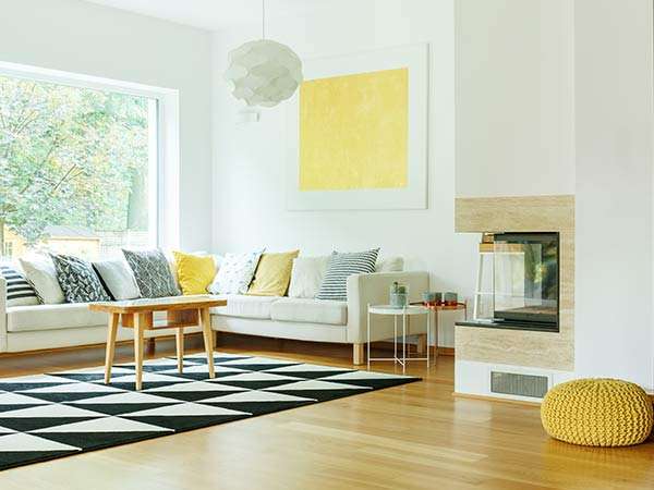

The best paint colours for small rooms are usually pale, softly toned colours with a high light reflectance value, used with low contrast between walls, trims and ceiling. For dark rooms, warm whites and gentle warm tints tend to work better than stark or cool whites. The real answer depends on which way the room faces and how you light it, so always test before you commit.
Small and dark rooms are where colour choices are most visible. A shade that looks fine in a bright living room can turn dull and grey in a south-facing hallway. Here is how to think it through.
Why do small and dark rooms behave differently?
Colour is light reflected off a surface. In a room with plenty of daylight, most colours look roughly like the chip. In a room with little daylight, there is less light to reflect, so colours look darker, greyer and often cooler than expected.
Small rooms add another factor: you are always close to the walls. Every surface is in your field of view at once, so contrast and strong colours feel more intense.
Dulux puts it simply on its colour pages: the way your room is lit impacts the way the colours in it will appear.
Start with light reflectance value (LRV)
Light reflectance value is a measure of how much visible light a colour reflects. Resene’s technical note on LRV explains that a colour with an LRV of 50 reflects about 50% of the visible light falling on it. The higher the number, the more light the colour bounces back into the room.
Paint manufacturers commonly publish the LRV for their colours. Dulux, for example, shows it on its online colour pages, so it is easy to compare your shortlist.
For a small or dark room:
- Favour a higher LRV for the main wall colour if your goal is brightness.
- Remember LRV only measures lightness. Two colours with the same LRV can look very different, one warm and one cool, so LRV narrows the field but doesn’t choose the colour for you.
- Don’t assume pure white is the answer. The brightest white is not always the one that looks best in low light.
The best paint colours for small rooms
Soft, cool colours that recede
Cool colours, such as pale greys, soft blues and blue-greens, tend to make walls feel further away. Dulux notes that cooler colours appear to recede, adding visual enlargement, while warmer colours draw attention. That makes cool pales a good fit for small rooms that already get decent light, such as a north-facing study or bedroom.
Warm whites and creams for rooms without sun
In Melbourne, south-facing rooms receive little or no direct sun. Cool colours there can tip into cold and grey. Dulux suggests that warm colours such as yellows suit south-facing spaces. In practice that often means a warm white, a soft cream or a pale warm neutral rather than a cool, blue-based white.
Low contrast between walls, trims and ceiling
Strong contrast draws the eye to the edges of a room, which makes its boundaries obvious. Lower contrast blurs those edges. Options include:
- Painting trims and doors in the same colour as the walls, in a more durable sheen.
- Using a lighter tint of the wall colour, rather than brilliant white, on the ceiling.
- Choosing one colour family for adjoining small spaces, such as a hallway and the rooms off it.
Colour on the ceiling
A small room with a low ceiling can feel taller if the ceiling isn’t a stark white box lid. Matching the ceiling to the walls, or using a paler version of the wall colour, removes the hard line at the cornice.
Can you use dark colours in a small room?
Yes, and they can look fantastic. A deep green, navy or charcoal in a powder room, study or snug can make a small space feel intentional and cosy rather than cramped. The trick is commitment:
- Go all in. Using the dark colour on walls, trims and sometimes the ceiling avoids the boxed-in look of a single dark feature wall.
- Light it well. Dark colours absorb light, so plan for good lamps or downlights.
- Accept the mood. A dark small room will not feel bigger. It will feel enveloping, which is the point.
A dark feature wall on its own in a small room can make that wall feel closer and the room feel unbalanced. If you love a deep colour, it often works better as the whole room than as a single accent.
How sheen and lighting affect small and dark rooms
Choosing a sheen
Sheen changes how much light a surface reflects. Dulux explains that higher gloss paints are very reflective, which can sometimes make colours appear lighter, while matt finishes soften glare and hide surface imperfections better.
In a small room, that is a trade-off. More sheen bounces more light, but it also shows every dent and patch, and you are standing close to the walls. Low sheen is a sensible middle ground for most walls, with semi-gloss or gloss for trims and doors. Our guide to paint sheen levels goes into each finish.
Your globes matter as much as your paint
Warm white globes push colours warmer; cool white globes push them cooler and sharper. In a room that relies on artificial light most of the time, test your shortlist under the actual globes you use at night. If you plan to change your lighting, do that first.
Test before you commit
Small and dark rooms are where colour surprises are most common, so testing matters even more here. Paint large sample boards, move them between walls, and look at them in the morning, afternoon and at night. Haymes recommends painting at least 1m² with a sample pot and viewing it in both natural and artificial light at different times of the day.
Our step-by-step guide on how to test paint colours covers sample boards, metamerism and lighting in more detail.
If the room has moisture issues, as many small bathrooms and laundries do, colour is only half the decision. See our guide to painting kitchens and bathrooms for choosing a paint that resists mould.
When a second opinion helps
You can usually sort out a single bedroom or study yourself with a few sample pots. It is worth getting help when several small spaces flow into each other, when the room is very dark, or when you need the colour to work with existing tiles, floors or joinery. AMP Master Painters includes colour consultation as a step in its process, and our interior painting team uses premium Dulux, Taubmans and Wattyl paints.
The bottom line
For small rooms, choose pale colours with a high LRV and keep contrast low. For dark, south-facing rooms, lean towards warm whites and soft warm tints rather than stark or cool whites. Dark colours can work too, if you use them boldly and light the room well. Whatever you pick, test it in the room, in its own light, before you buy the full cans.